
“The Bet was rigged, He made me believe -Now there’s Darkness in my Soul -I want to Die… – Again.” – Opening lines of Spawn Issue 1
I love Spawn. As a character, as a design, as a symbol of independent comics, all of it. I start this retrospective with that being said outright, because I don’t want there to be any question as to my intentions with this series. I am not writing this to espouse my love of Spawn and to give praise to Todd McFarlane and (although later in the series) Greg Capullo and Brian Hulgin. The point of this series is to do a deep dive into 90’s comics and try to answer the question of whether the comics of the time were technically and mechanically well executed. And, honestly, there were really only 3 places to start – Todd McFarlane’s Spawn, Todd McFarlane’s Spider-Man, or Chris Claremont and Jim Lee’s (Adjective-less) X-Men. In my opinion, Spawn is the ultimate 90’s comic book – Spawn is undeniably well-designed, he is not a true superhero, he is a dick, and the story is incredibly meandering and exists solely to put Spawn in cool situations in which the art can shine. Most people would agree with those statements, but those do not answer the real question: Spawn – Excess or Excellence? Without further ado, let’s dive into issue 1: Questions Part 1
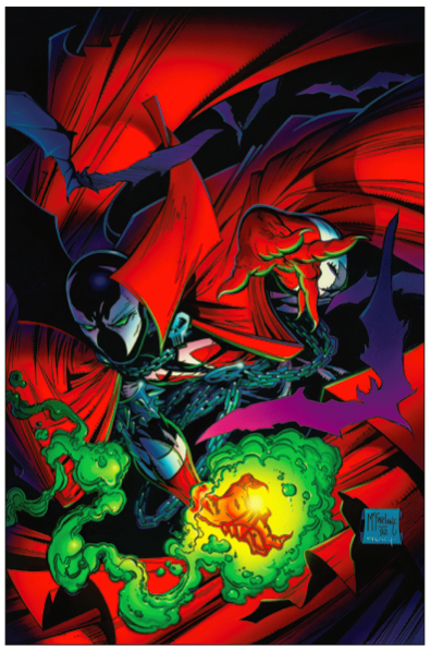
The cover of Spawn 1 depicts the titular character in a classic acrobatic pose (reminiscent of Spider-Man, which Todd had previously done art for), left hand pointed at the camera showing depth, and right hand in the lower bottom highlighted by a sickly yellow-green glow teasing his magical powers. There are also monochromatic purple bats in both the background and foreground (invoking ideas of Batman, which Todd also did art for, or Dracula, which his cloak seems to be inspired by). Spawn’s costume is composed of a full face mask with KISS-esque markings, skull clasps on the cape and belt buckle, chains for a belt, and a huge cape with a turned up collar (see above, Dracula). The primary colors are red and black, which every 90’s kid knows is the coolest colors. All in all, the cover to Spawn 1 is incredibly striking, demands your attention, and also does a great job of showcasing many different facets of the character (even some that don’t really show up in this issue) which was ideal since Spawn was a new comic at the time.
Issue one begins with a narration and a scene-defining series of panels showing the earth from space, and ending with a look at a city skyline. The narration sets the stage for one of the main plot lines of early Spawn comics – Spawn has amnesia, and does not remember who he is, how he got here, where here even is, and what his goals or desires are. This is an exceptionally clever move on Todd’s part – Spawn is a new character for readers and needs a whole lot of buy in to continue to pick up the next issues, so to invest the reader in Spawn’s story, we learn of his backstory at the same time he does. We do not have to wait 2 or 3 issues to get this information, which is good, because some readers will not pick up issue 2 or 3.
Todd was/ is quite reliant on “Info Dumps”, which is a literary term referring to the inclusion of a character or scene in which the sole purpose is to dump as much background information as possible onto the reader to answer their internal questions and set the stage for the coming plot points. You see this quite often in fantasy novels where the main character, being a rural teenager, meets a wise old man in a bar and asks “what’s going on?”. This simple question allows the other character to give a 20 minute explanation of the current geo-political climate and a 200 year history into the land and surrounding lands. In lieu of this method, which requires a chance meeting of characters, Todd uses newscasters (although, who exactly is watching the newscast is never shown). I feel that, as an idea, the newscasters have the ability to work quite well – however, they more often than not pull the reader away from the ongoing plot. There is not a background in which to cement the newscast into a particular place or time (although there is a year “1987” in the center, which will come up later), and the characters do not show movement between the panels.
The newscaster section is also not that useful, considering the next 2 pages basically summarize what they established, but in an interesting series of monochromatic red and purple panels. These pages show that Todd didn’t quite have enough confidence in his depiction of the passage of time, since the only point not brought up in these series of panels is that Al Simmons died in 1987, and the comic takes place in 1992. I also want to take a moment to talk about how effective the lettering style is at setting a tone. Tom Orzechowski chose a type font (or hand writing if it is hand written as it appears) that fits this gritty, moody book, and, in the words of Chris from “Comictropes” on YouTube, “good lettering is lettering you do not notice.” This lettering style does not pull you out of the action and does not feel out of place.

The following two pages introduce the reader to the concept of Spawn’s Power Meter. This meter would be an ongoing feature in Spawn comics and (somehow) relates to how much relative power Spawn has. The gimmick is that, if his power level ever reaches 0:0:0:0, he would be brought back to Hell. The power meter at this point is full, reading 9:9:9:9. This is also a cool concept, but rather unnecessary in the grand scheme of the story. I can only assume Todd created this plot device as a way to explain why Spawn does not just “nuke” all of his enemies and race straight to armageddon. I cannot attest to the feeling at the time, but in modern fiction and fantasy stories we as readers just kind of “head canon” the power gating. Never once in the first 100 issues of my recent read through of Spawn did I feel that the power meter was truly necessary, or more effective than just saying “Spawn is hurt/tired/exhausted and cannot use his powers effectively.”
The very first double-page spread of the Spawn series is none-other than the mythical “90’s Sideways Splash Page”. This is the first full reveal of the Spawn costume within the comic, and this pose fits Spawns build and size a little better than the one on the cover. It is stated in further issues that Spawn is over almost 7’ tall and well over 500 pounds (though a good portion of that weight is his suit). To me, I find the poses that Batman would make work best for Spawn, versus the poses that Spider-Man or Daredevil would make.

To be continued in Part 2!

Leave a comment